Spiral Staircase
Layout Design
The history of the yearbook can be traced back through centuries and is a key component to documenting and creating a time capsule for each school year. At my high school, our yearbook was named after the central structural component of the building: a Spiral Staircase

My role
Over my grade eleven and grade twelve years, I held the role of Editor-In-Chief. My primary responsibilities included:
- Running the application process and selecting my committee members
- Communicating between my committee, vice-principal, staff advisor, and Friesens' representative
- Creating a theme and ladder
- Delegating pages and sections
- Setting and tracking deadlines
- Designing my own layouts
- Reviewing, editing, and providing feedback for all committee submitted pages
- Collecting and organizing senior grad quotes and photos
Initial experience
During my grade eleven year (2016-2017) the school was in need of a yearbook editor-in-chief. The previous editor-in-chief had failed to choose and mentor an editor for the upcoming year so the status of our yearbook was left with uncertainty. I had experience working on a yearbook from my junior high school but had no knowledge of the yearbook and printing process in my highschool. Regardless, I was passionate about it and decided to step up and take on the role of editor-in-chief.
I let my senior editor, a graduating student at the time, take charge of the artistic direction of the yearbook. He took the yearbook in a very bright, bold, and abstract direction, something I would have never chosen to do on my own. I appreciated the chance to design something new to me and outside my comfort zone.

Chosen Colour Palette and Fonts for 2016-2017 Yearbook
We received a lot of criticism about the bold design following distribution day but I was proud of the work we had accomplished. Looking back I understand how the bold design, during an era of “minimalism” might have generated some strong opinions.
Without any instructions on how to run the yearbook from the previous editor-in-chief, I was just learning and being involved in the process simultaneously. This resulted in a lot of barely-reached deadlines and mistakes such as duplicate photos or spelling mistakes in the final yearbook. Determined to improve and create a better yearbook during my graduating year, I took a Sharpie to my printed copy and marked all the mistakes I could find.
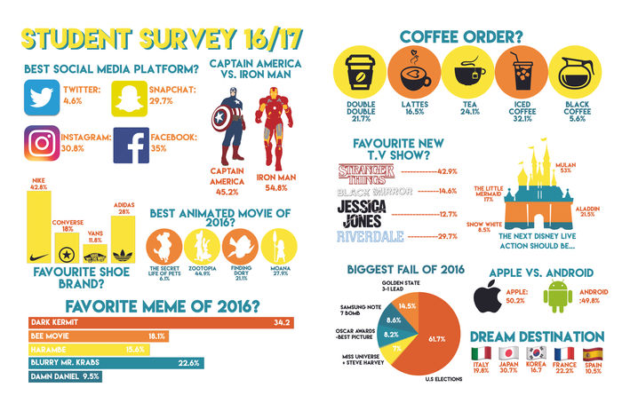
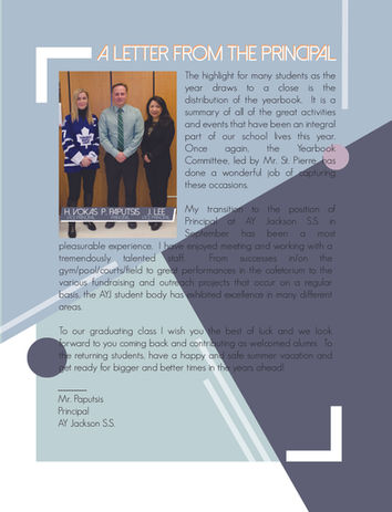
A selection of layouts from the 2016/2017 Yearbook
Learnings
One key thing that I took away from the 2016-2017 yearbook was the importance of attention to detail. I specifically focused on ensuring consistency of font sizes, double-checking copy for spelling and grammatical errors, and ensuring that the photos were appropriate sizes.
Moving Forward
With my newfound experience, I was able to pinpoint the pain points of the process and tackle those from the beginning. I took those lessons and implemented changes during the next (2017-2018) yearbook. For example, we had a lot of issues previously coordinating with the sports department. To relieve that pressure I created a sports lead role. This gave me the time to focus on additional details such as creating mini illustrations for the students missing graduation photos.

An example of our illustrations in the 2017-2018 yearbook
Creating a new look
My goal when deciding on the next yearbook theme was to create something that was different from the previous yearbooks and that would be received well by the student body. I chose to focus on more geometric shapes rather than the previous abstract shapes. For the colour palette, I played with paint swatches and colour picker apps to create different colour palettes until I settled for a muted blue, purple, and orange palette. With orange and black being our school colours, it was important to me to still include an orange in the colour palette. In order to communicate my design vision to the yearbook committee, I created a Pinterest board for inspiration.

Chosen Colour Palette and Fonts for 2017-2018 Yearbook
With a fresh year and a new vision, my second year as editor-in-chief definitely ran a lot smoother. We still encountered many problems such as having to constantly rearrange the ladder when new events were hosted at our school. However, by drawing from my previous experience we were better prepared to face these challenges. In the end, we created a yearbook that was well received by the student body and incorporated new sections to showcase more features of student life.
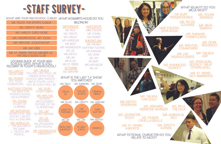
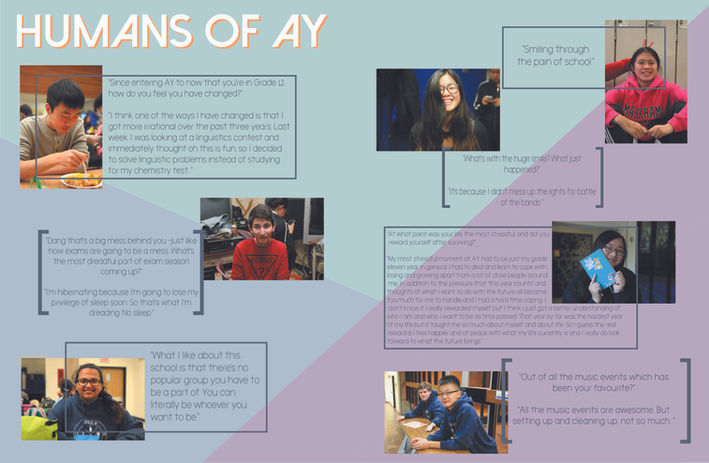
A selection of layouts from the 2017/2018 Yearbook
Final Takeaways
This project taught me how to adapt to unpredicted situations, adhere to ongoing deadlines, spearhead a team to create a final product, and mentor a future yearbook executive team. I learned what a real difference that details can make and how to properly delegate tasks so that we could all reach our full potential. Taking this role definitely wasn’t easy and caused me many sleepless nights. However, the experience of seeing something on a screen for months to being able to hold a physical book in your hands is one of the most rewarding feelings out there and something I would proudly do again.


